
This is part 1 of our review of BibleWorks 10. See also Part 2 on New Features.
This post will discuss the interface and design of BibleWorks, which I have always appreciated the most about the program because of its simplicity and down-to-business look. One friend says it looks like it was built for MS-DOS, which was a humorous exaggeration, but it truly is a simple, text-based design for serious exegetes. Moreoever, it’s lightweight and loads and operates far quicker than Logos, which is a beast even on my brand new, high quality Lenovo Yoga Pro 2. Searches on BW are nearly instantaneous and can be quite complex, as I’ll demonstrate in future posts. For now, let’s look at this simple, yet elegant design.
NOTE: My last version was BW 8 (I skipped v. 9), so some of my comments may pertain less to those wondering if they should upgrade from v. 9.
One of the best elements of the design is the ability to add a second Analysis column (fourth column total), which was also possible in v. 9, but there are a few improvements. You can get a second window of text to compare parallels in two other ways (by using the “Browse” tab in the right column or by using the Parallel Versions Window [Tools –> Viewing the Text]), but having a permanent fourth column that also has all 18 tabs of the right column is inestimably helpful. An improvement to v. 9 is that you can close the fourth column if you want, and you can use the Analysis Tab Options to choose which resource tabs you want to show in which of the double columns. I moved the Resource tab to the far right and left the Analysis tab in the other Analysis column since I use those two tabs the most and want to use them simultaneously (screenshot 1).
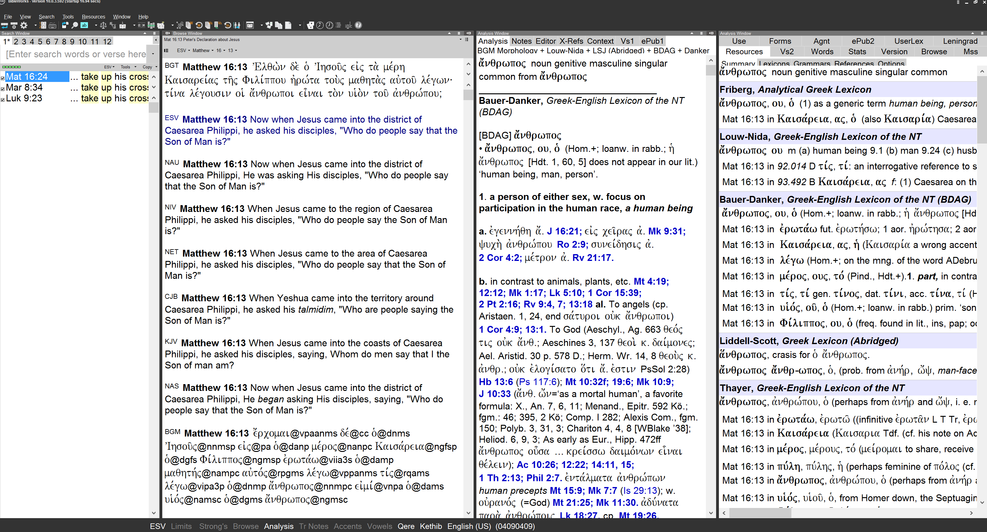
Screenshot 1: BibleWorks 10 with 4 Columns (Click to see Full Size)
Now, after seeing the first screenshot you may notice the major flaw with BibleWorks 10 on some devices. My computer works at an optimal resolution of 3200×1800, which is an HD resolution that is incredibly sharp. The downsize is that some programs, such as Windows Media Player (a Windows program!!) has incredibly tiny menu bar buttons and play/stop buttons. They are almost unusable. This is an unfortunate result of the newer, high resolution devices (tablets and some laptops like mine) that are being made.
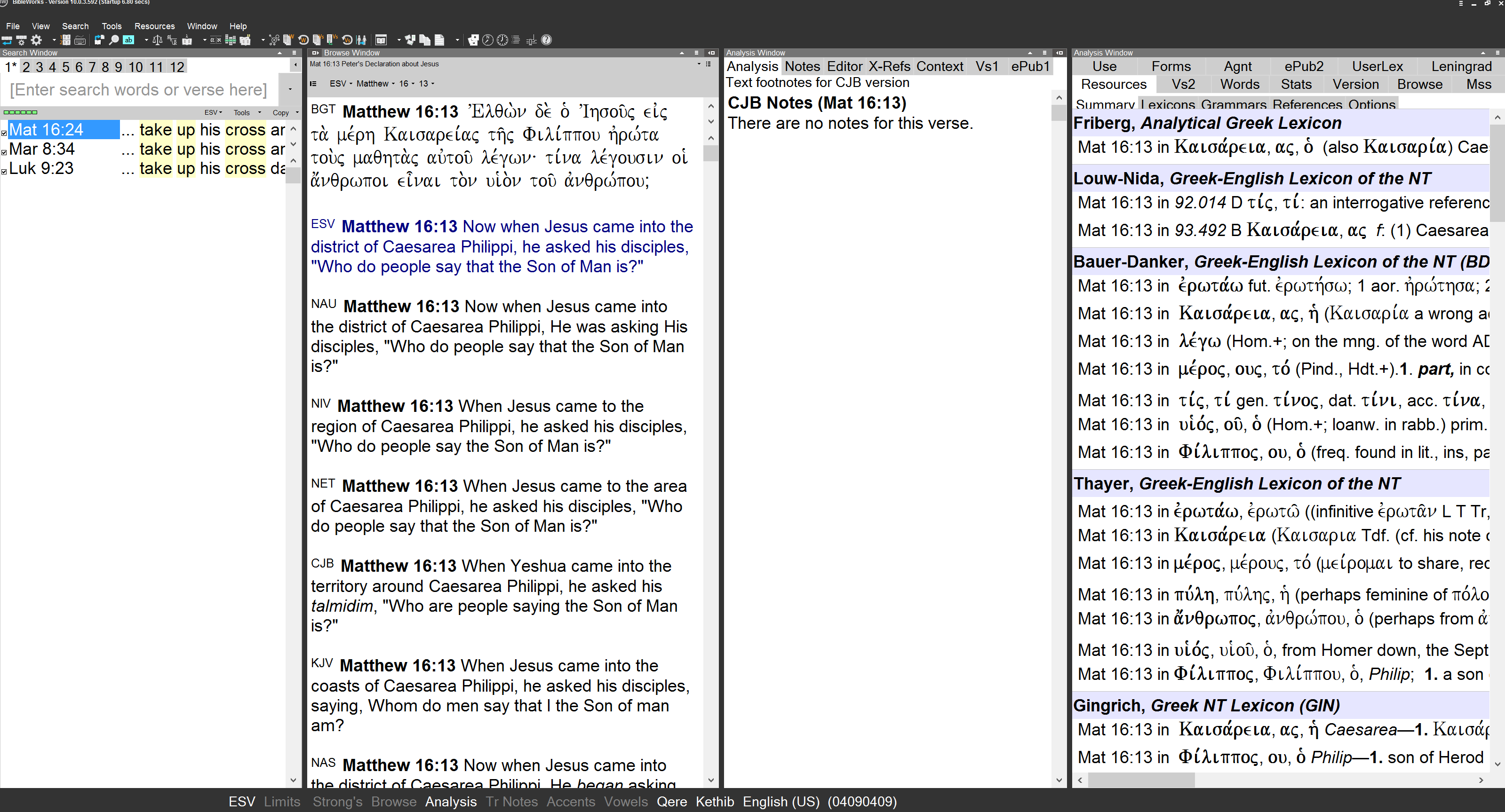
BibleWorks suffers from the same issue in the menu bar, as you can see from screenshot 1 if you enlarge it. You can also see that some of the tabs don’t show completely but nest into one another (try reading “Summary,” “Lexicons,” etc. in the far right column, bottom row: you can’t see the bottom half of the words).
In an effort to fix the overall problem of scaling, BibleWorks did add a scaling option (View –> Scaling). This enables you to scale up the entire program so everything is bigger. Screenshot 1 is scaled to 120%, and screenshot 2 below is scaled up to 140% so you can see the difference. Interestingly, the search window tabs (1, 2, 3, etc.) are cut off more at 100% scaling than at 140% scaling, but the Summary, Lexicons, etc. tabs in the right column get cut off the same amount.
Screenshot 2: Scaling at 140%
I e-mailed the developers to ask them about this and they say it’s far more difficult to scale menu buttons (the ones that appear tiny on my screen) than to scale the rest of the program. They say it’s a problem with Windows that will helpful be resolved in the future as more high-res devices are made, and I believe them, since I have the same issue with many other Windows programs. So this is not a strike against BW, but is a significant design element to know before purchasing the program. I do think BW should be able to fix the tabs that nest into one another, since they nest the same amount no matter what the scaling.
Now, back to more positive elements. They added a color scheme option to the program. I’m good with black and white myself, and it’s one of the reasons I enjoy the simplicity of the program, but for those of you who just need some color in your life, you can click any color scheme or make one yourself (screenshot 3).

Screenshot 3: Color scheme option window, with “BW Green and Yellow” selected
One other nifty feature is the ability to color code words based on morphology (screenshot 4). If you are a beginner or intermediate biblical language reader, you may find this useful, for instance, to quickly spot the verb and subject of a sentence. This also doesn’t give away the parsing before you’re able to figure it out yourself, so it doesn’t cripple you as much as immediately hovering over the word to see the parsing, or other resources that include the parsing directly below the word.
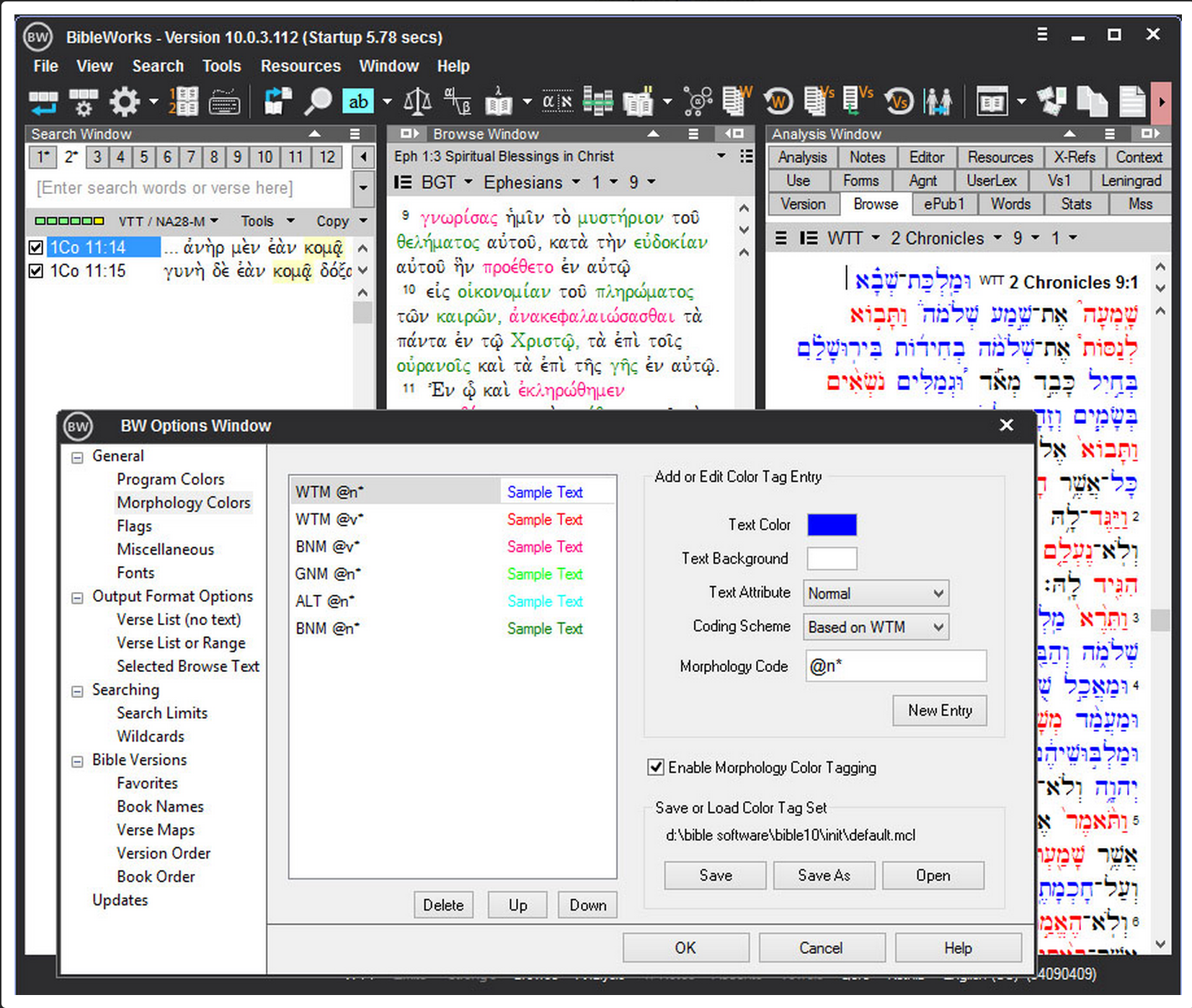
Screenshot 4: Morphology color-coding
In summary, BibleWorks now looks just as good as it ever did, but they have added some customizable options for those who want to make it feel a bit more “you.” The customization of the second Analysis window is probably the most helpful feature and will help you do word studies, check cross-references, and check other tabs even quicker than in previous versions.
The next installation of our review series on BW10 will cover new features from versions 8 and 9, some of which I am really excited to tell you about. I’ve used many of these features to prepare our Basic Greek Videos and our Colossians Greek Reading Videos.
Find BibleWorks here on Amazon.
![]()